Surface Tension

A little poem inspired by Henri Cartier-Bresson’s famous image, Behind the Gare St. Lazare, 1932.

Surface Tension

Defying gravity, hanging between earth and eighteen-percent sky
A blurry cartoon man looks and leaps and never lands
The take-off hurried
but so graceful that it leaves just a ripple witness and hat firmly fixed.
A shadow hangs below—his, if experience can be trusted and photographs don’t lie— ever threatening to connect the reflected with the reflection.
A “Do Not Walk” silhouette sign in greyscale where
fiery flashing red should be.

The sensible figure observes, comforting the fence behind,
a watcher, not a risker.
Will he have no brave story of his own
but settle for singing another man’s song?

The gravity-defier will never settle
Content to hover and fly, tantalizing a puddle
He has learned through the years the science of water and the art of birds
Born in steam-time, he embraces weightless the world of wonders
Rare-earth magnetic heels repelling the mirror planet below him

The station
Stationary
Surface tension.

William Notman, Visionary Photographer

I had the chance yesterday to visit Notman: Visionary Photographer at the Canadian Museum of History. The large exhibit covers the photographic output of William Notman (1826–1891) who opened numerous studios in Canada and the U.S. during the Victorian period. The Scottish-born Notman moved to Montreal in 1856 and used the city as a base to develop a thriving business built on studio portraiture, documentary photography and technical innovation.

A.H. Buxton

Montreal, QC, 1887
Wm. Notman & Son
1887, 19th century
Silver salts on paper mounted on paper – Albumen process
17 x 12 cm
Purchase from Associated Screen News Ltd.
II-82621.1
© McCord Museum

I took in Victorian Giants: The Birth of Art Photography at the National Portrait Gallery when I was in London in May, so I wasn’t sure that I was ready for yet another Victorian photographer. I found that the pictures by the photographers on display—Julia Margaret Cameron, Lewis Carroll, Clementina Hawarden and Oscar Rejlander—were often sentimental, somewhat repetitive and already very well-known. (I may need to work on my attitude, given that there is a Rejlander exhibit now on at the National Gallery of Canada and I will likely go to see it…)

I’m glad to say that I found Notman’s work quite interesting. I was impressed both by his business acumen and also by his pursuit of new technology to improve the way he made his images (an early adopter of artificial light in the studio and a pioneer in the creation of snow and ice effects, as well as an early master of creating large-scale composite images) and to get them in front of audiences (a contributor to the half-tone printing process, a consummate merchandiser and marketer, and someone who fully used the work of studio teams to make and process pictures). I found many of his portraits to be almost modern in their approach, with a directness that was rarely sentimental.

I also appreciated Notman’s documentary work that often portrayed scenes with which I am familiar—Montreal, Ottawa, Toronto and Niagara Falls. Many of these photographs were no doubt made to help market a young Canada to a European audience, but they serve as an impressive record of what life looked like in this country in the late 1800s. It is also very helpful that Notman employed an organized system to identify every one of the images he took and that some 450,000 of his images have been catalogued and preserved in Montreal’s McCord Museum.

Vernissage—Anthropocene

Back in September I was able to attend the pre-opening and vernissage of Anthropocene, the latest collaboration by photographer Edward Burtynsky and filmmakers Jennifer Baichwal and Nicholas de Pencier. The three also collaborated on a previous project, Manufactured Landscapes.

Anthropocene opening at the National Gallery of Canada (NGC), Sept. 26, 2018. From left to right: Marc Mayer, Director of the NGC; Andrea Kunard, Associate Curator, Canadian Photography Institute, NGC; Nicholas de Pencier; Edward Burtynsky; and…

Anthropocene opening at the National Gallery of Canada (NGC), Sept. 26, 2018. From left to right: Marc Mayer, Director of the NGC; Andrea Kunard, Associate Curator, Canadian Photography Institute, NGC; Nicholas de Pencier; Edward Burtynsky; and Jennifer Baichwal.

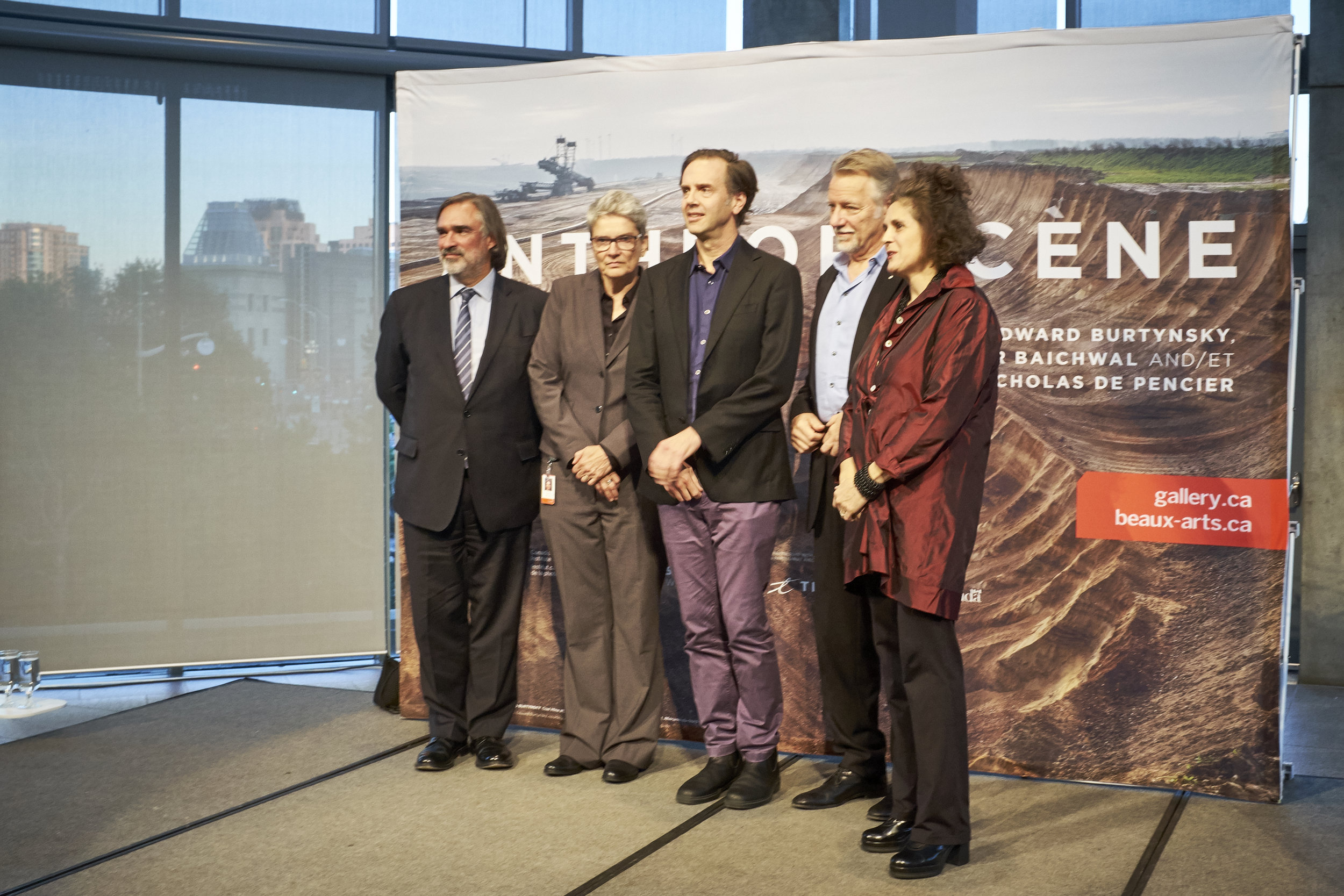
Anthropocene opened in two complementary versions, one at the National Gallery of Canada in Ottawa and the other at the Art Gallery of Ontario in Toronto. The title of the project is a still-contested term that refers to a new geological era where “…human-kind has caused mass extinctions of plant and animal species, polluted the oceans and altered the atmosphere, among other lasting impacts” (Stromberg, 2013)

The project is a large-scale multimedia production comprising still photography, video, a movie, augmented reality installations and a book. It is in line with Burtynsky’s other work both with and without collaborators: bold, richly layered, large-format photographic prints that make viewers stop to look at things that are worrying.

Anthropocene is very much a project, not only in the sense that it combines the talents of several Canadian artists, but also because it uses art to advance particular ethical and political positions. Although the artists—in words, at least—are careful to lay out information rather than to preach their stance on human impact on the environment, the conclusion of their work could not be clearer. It is possible to imagine a series of images showing the benefits of resource extraction for humanity—or even the utter dependence of our economies on fossil fuels—but that is not what has been done here. Anthropocene is a damning artistic documentation of wholesale exploitation, waste and degradation for the planet and its lifeforms.

I have seen and appreciated Burtynsky’s photographs for a number of years but I find that I am now looking at them differently since reading Stephen Shore’s (2013) brief book. Although I have always appreciated the beauty and content of the images it is only now that I am looking at them as photographs. The images play with framing, scale and geometry in such a way that it is not always clear what you are looking at.

Many of the photographs are printed so large and cover such a vast area that you must look at them twice: once from farther back to take it all in, and then an implied invitation to draw closer to peer at details and to orient yourself in the frame. Sometimes, for example, it is only at nose-distance that tiny blobs of colour reveal themselves to be heavy vehicles in an immense open-pit mine. By being invited into a two-step viewing, I found that my reaction was often to be impressed by beauty at large-scale, and to be shocked by the detail as I moved closer and more fully took in what I was seeing.

A viewer in front of one of the large-scale images from Anthropocene.

A viewer in front of one of the large-scale images from Anthropocene.

In some cases the photographs contain few or no markers of scale or orientation and show a radically flattened perspective: is this scene large or small? am I viewing head-on or from above? As a viewer, I have little choice but to remain in front of the image and puzzle out how I should assess it. Once again, the effort is rewarded by an aha!, but it means that it is almost impossible to skip past Burtynsky’s work in a casual way. It draws you in with its geometric beauty and large physical print, and almost always delivers a punch. For some images, it is necessary to repeat the viewing cycle more than once: distant for a global view, then up close for precise detail.

Anthropocene, like Manufactured Images before it, demands time from its audience to achieve full effect.

Could you use such a set of techniques to manipulate the viewing public into accepting a particular ethical position? Yes, I suppose you could. But living near the National Gallery of Canada in an area that is now regularly visited by ice stormsfloods and, most recently, tornadoes, the message of climate change and environmental degradation is not a hard sell. It has the ring of truth.

Burtynsky was Master of Photography at Photo London in May, where I happened to bump into him while I was looking at one of the large prints to be included in Anthropocene. I told him that I always felt conflicted when I looked at his images, because they are so beautifully shot and printed, but their content is so often disturbing. “Good,” he replied. “That’s what you should feel.”

And I do.

Visiting the exhibit was like an object lesson to work through some of Shore’s points about the representation of three-dimensional reality within a two-dimensional frame. I will be spending more time thinking about what impact the factors of scale, perspective and orientation have on my own work and how I can use them to best advantage, to support what it is that I want to say and to help shape the experience for the eventual viewer.

Two shows at the Tate Modern

This was my first chance to visit to the Tate Modern and I think I would have gone no matter what was on display. I was anxious to see what had been done with the converted power generating station and to walk through one of the world’s most famous galleries. I arrived a little late in the day, however, and only had time to take in two of the shows: Picasso 1932: Love, Fame and Tragedy and Shape of Light: 100 Years of Photography and Abstract Art.

The Picasso exhibition was dedicated to a single year within the artist’s life that was a time of transition for him in terms of his personal life (end of a marriage, infatuation with a new and younger woman) and his art (questions about his ability to produce fresh and exciting work, now that he had reached middle age).

The biographical context for the show was interesting and helpful although I found that I have not (yet?) become a Picasso fan. I am well aware of the artist’s influence on the direction of 20th century art but sometimes the abstract paintings of women start to look the same to me.

I was very surprised to find, then, how often I appreciated the initial sketches of his work rather than the finished pieces. Without garish colour and with less distinct lines, the drawings had a lightness and playfulness that I found appealing. If anything, they might encourage me to go back to the paintings with fresh eyes.

Pablo Picasso — Femme nue, feuilles et buste, 1932

Pablo Picasso — Femme nue, feuilles et buste, 1932

Pablo Picasso — Jeune fille devant un miroir, 1932

Pablo Picasso — Jeune fille devant un miroir, 1932

Pablo Picasso — Femme à la fleur, écrivant, 1932

Pablo Picasso — Femme à la fleur, écrivant, 1932

Pablo Picasso — Femme nue couchée, 1932

Pablo Picasso — Femme nue couchée, 1932

From the Tate Modern catalogue:

Shape of Light is the first major exhibition to explore the relationship between the two, spanning the century from the 1910s to the present day. It brings to life the innovation and originality of photographers over this period, and shows how they responded and contributed to the development of abstraction.

Key photographs are brought together from pioneers including Man Ray and Alfred Stieglitz, major contemporary artists such as Barbara Kasten and Thomas Ruff, right up to exciting new work by Antony Cairns, Maya Rochat and Daisuke Yokota, made especially for the exhibition.

This was a wide-ranging exhibition, in terms of the period covered, the techniques employed and the artists represented. Although many of the pieces were considered daring or avant-garde in their day, quite a few now seem old-fashioned. I think this may have to do with the fact that the works are dependent on the particular characteristics of technologies that are now outmoded. They may have a momentary revival or nostalgic value, but their time has passed. By contrast, the Picasso paintings on show at the Tate—although older than a lot of the pieces in the Shape of Light show—continue to have a life about them, perhaps because the processes and materials involved in painting canvas have not become as tied to a particular era and then left behind.

Unfortunately, and perhaps ironically, no photography was allowed in this exhibit.

The Art Gallery of Ontario—February 2018

On a weekend visit to Toronto I had the opportunity to spend a few hours at the Art Gallery of Ontario, one of the larger galleries in Canada.

It was hard not to be impressed by the scale of the Thomson Collection of some 2,000 pieces of Canadian and European art, including a large group of miniature ivory busts.

Some of the ivory miniature busts in the Thomson Collection, AGO

Some of the ivory miniature busts in the Thomson Collection, AGO

And since I saw an exhibition of Bernini’s sculptures at the National Gallery of Canada a number of years ago, his work has stood out  whenever I have come across it in a new setting. It is hard to miss the artist’s consummate skill at capturing facial expression and every fold of a garment in stone.

Gian Lorenzo Bernini, Pope Gregory XV, 1621

Gian Lorenzo Bernini, Pope Gregory XV, 1621

While I enjoyed many of the pieces I saw at the AGO, I have to admit that I most appreciated the works I saw from contemporary Indigenous artists.

It is impossible to mistake the work of Norval Morrisseau for anyone else’s. He has an immediately recognizable style—his paintings are explosive and raw depictions of Indigenous cosmology and myth.

View of Norval Morrisseau’s, Man Changing into Thunderbird, 1977

View of Norval Morrisseau’s, Man Changing into Thunderbird, 1977

I was also taken with the rich and intricate beauty of Christi Belcourt‘s work, The Wisdom of the Universe, painted to mirror traditional beadwork.

Christi Belcourt, The Wisdom of the Universe, 2014

Christi Belcourt, The Wisdom of the Universe, 2014

But the piece that caught my imagination was the installation by Bonnie Devine, called Battle for the Woodlands: AnishinaabitudeAcross three gallery walls, the piece illustrates the arrival of Europeans in what is now Canada and the rapid expansion of settlement westward across traditional Indigenous territories.

I found the tracing of treaty boundaries and the depiction of the Great Lakes and waterways as animals made the map of the place I live in come alive in a new way for me. It overlaid an alternate view of reality on top of geography that I know well, but can now think of in a different way. This piece made me imagine Canada differently and I believe I will carry it with me for a long time.

Bonnie Devine, Battle for the Woodlands: Anishinaabitude, 2014–2015

Bonnie Devine, Battle for the Woodlands: Anishinaabitude, 2014–2015

Detail of Bonnie Devine, Battle for the Woodlands: Anishinaabitude, 2014–2015

Detail of Bonnie Devine, Battle for the Woodlands: Anishinaabitude, 2014–2015

Panorama of Bonnie Devine, Battle for the Woodlands: Anishinaabitude, 2014–2015

Panorama of Bonnie Devine, Battle for the Woodlands: Anishinaabitude, 2014–2015

Back to the Met

Like many of the world’s great art galleries, NYC’s Metropolitan Museum of Art has such a massive collection that it is impossible to do it justice in a single visit. And then there are the temporary exhibitions and the fact that the public collection is spread across three locations Manhattan locations …

During our early January 2018 trip, we had the opportunity to take in “Michelangelo: Divine Draftsman and Designer,” sculptures by Rodin, a David Hockney retrospective a survey entitled “Delirious: Art at the Limits of Reason, 1950–1980,” and a curation of items from The Met’s permanent collection called “Reimagining Modernism: 1900–1950.”

The Michelangelo exhibit was impressive not only for the sheer scope of the art works and periods covered, but also for the amount of technical detail on how he went about conceptualizing and creating. As was (and is, I suppose) common with other major artistic figures with a prolific output, Michelangelo (1475–1564) became most active as a draftsman and designer overseeing the work of craftsmen who made his ideas a reality. He was the CEO of a design shop and factory. I have known for a long time that this was the case, but to see the evidence up close—annotations to workers, evidence of the use of tools and drawings to create templates that could be used over and over—was fascinating.

Many of Rodin’s (1840–1917) best-known sculptures were on display—Le Penseur attracted a lot of attention in a crowded hallwaybut what was most interesting to me was the opportunity to see how he evolved as a draftsman over the course of his career. And the rough-hewn bases of his statues made me wonder whether his creations were emerging from the stone or sinking into it.

Le Penseur, Auguste Rodin

Le Penseur, Auguste Rodin

The David Hockney retrospective spanned the years between 1960 and the present day, with many works on display. It was a rich exhibit as much in quantity as in the quality of the colours of a consistent palette that Hockney has favoured throughout his career. The canvases are lush and pastel, and seem to illustrate an idealized world that is close to, but just beyond this one. Throughout, you can sense an almost sub-tropical warmth in the paintings, whether in Californian swimming pools (where you’d expect it) or in Yorkshire landscapes (where you wouldn’t!). Hockney’s persistent vision of the attractive world he inhabits artistically colours even his portrayal of his homeland.

“Delirious: Art at the Limits of Reason, 1950–1980” starts with the question, “Can postwar art be understood as an exercise in calculated insanity?” The exhibit looks at irrationality in art following WWII in so many categories that is doubtful that the works of the 60+ artists would have been displayed together before now. The principal idea is that each of the artists represented responded to a modern world that seemed to them absurd and lacking in coherent meaning. “Delirious” is reactive rather than proactive—it is a response or witness to absurdity (or an accusation?) but none of the selected artists offers a prescription to a confused and hurt world. The works on display span 30 years in the previous century, but are we any better able to make sense of the world we live in today, apart from totalizing narratives of power and commercialism?

According to The Met’s write-up, the curated display of modernist works we saw “reinterprets and presents afresh the Metropolitan’s holdings of modernist paintings, sculpture, design, photography, and works on paper.” The pieces were arranged according to seven themes—Avant-Garde, Direct Expression, Abstraction, Bodies, Work and Industry, the Metropolis, and Retreat—and I found the grouping helpful in putting together an interpretive frame. The museum is proud of how much “vistas and sight lines owe to the building of new walls and the reconfiguration of existing walls, which inject new life into these spaces” and I agree with this completely. More than once, I rounded a corner only to be stopped in my tracks by the power of art works arrayed beautifully—it was a kind of visual treat. It made me think of the power that museum and gallery curators have: to show a work in a flattering or unfavourable light and to influence the viewer’s interpretation of a piece by controlling the context around it.

Constantin Brancusi, Bird in Space, in front of Pablo Picasso’s Nude Standing by the Sea and Burgoyne Diller’s Second Theme

Constantin Brancusi, Bird in Space, in front of Pablo Picasso’s Nude Standing by the Sea and Burgoyne Diller’s Second Theme

Of all the shows we visited in the gallery, “Reimagining Modernism” engaged me the most and I am not sure what to make of that. Perhaps I am responding to a romanticised idea of the modernist period, or perhaps it is the combination of bold, coherent ideas, beauty and function coupled with confidence in progress—a narrative that we now know can lead just as easily to advancement for humanity as it can to totalitarianism.

Coffee Service 1934, by Helen Hughes Delany (1885–1968), stainless steel and bakelite.

Coffee Service 1934, by Helen Hughes Delany (1885–1968), stainless steel and bakelite.

A Trip to the Whitney

My family and I took a quick break in New York City in the first week of 2018 and arrived just in time for a major snowstorm, after driving through hours of snow squalls on our way from Ottawa. (And we didn’t know it then, but we would also drive the eight hours home through yet more snow squalls.)


We had never visited the Whitney Museum of American Art so it provided an ideal activity for a day when the weather was miserable. The collection is housed over several floors in a new building with plenty of space for taking in the work, especially for larger-scale pieces in the ‘mid-career’ survey of work by Laura Owens (born Ohio, 1970). Owens’ work can appear deceptively simple but I found it helpful to view all of her exhibit before making too many judgements. Her paintings and installations do indeed contain simple elements, but they are often layered with text and texture, digitally-manipulated photographs and even other paintings to create more complex and sometimes humorous work.

I left this exhibit with a sense of quiet enjoyment of light, and life and colour.


If Owens’ work showed flashes of humour, “Jimmie Durham: At the Center of the World” contained a strong mix of humour, satire and the absurd. Durham (born USA, 1940) worked as a political organizer for the American Indian Movement in the 1970s and his commitments are present throughout his work. He consistently draws attention to the impacts of the colonisation of the USA but probably manages to do it without alienating the people who most need to hear his message. To my mind, Durham use of humour and satire to communicate serious messages make him a trickster of sorts (although some contend that his claims to be Cherokee are false and that he is taking the trickster role too far). Cherokee or not, he draws on found objects to create works that draw on traditions of North American Indigenous art but clearly show their postmodernist and technological origins.

Mad props

Well, not all of them are mad, but a few looked a bit tired. Some shots from a quick visit to the National Arts Centre's properties warehouse this morning. It was fascinating to take a peek behind the curtain and know that these odds and ends—with the right lighting and the right cast—create magic.

Fujifilm X-E1 at ISO 3200 with 18–55mm f/2.8–4.0 zoom

Three exhibits at the National Gallery of Canada: land and landscape

On November 5 I visited three new photography exhibits at the National Gallery of Canada in Ottawa. In one way or another, all three were tied to the Canadian landscape whether in the past or currently.

For Canadians who were old enough to read books in 1976, the exhibit Between Friends is a reminder of a book of the same name published as a gift from Canada to the U.S. on the occasion of that country’s bicentennial. For this exhibit, photographer Andreas Rutkauskas revisited many of the locations along the 8,891 km border between the two countries. While much of the geography has not changed, the exhibit contains reminders that crossing the border has become more difficult and formal in recent years because of the rise of protectionism and isolationism in the U.S., and the new geopolitical reality throughout the world. The pictures are subtle and often beautiful and the boundary they point to can seem an artificial and arbitrary one. Why should the living situation of people leaving a couple of hundred metres apart be so different?

A similar theme is evoked in Frontera, a drone’s-eye view of the U.S.’s southern border with Mexico. These pictures, however, do not contain the open spaces and lightly-patrolled woodlands seen in Between Friends. The Mexican border is lined by a steel scar that runs across the landscape for many hundreds of miles through inhospitable wild places, sometimes broken by poor settlements on one side and wealthier communities on the other. More often, though, it is difficult—if not impossible—to tell which side of the frontier is which: the land is the same and it is a political negotiation that has traced a line through it. Looking at many of the pictures by Mexicans Pablo López Luz and Alejandro Cartagena, Canadians Mark Ruwedel and Geoffrey James, Swiss Adrien Missika, American Kirsten Luce and German Daniel Schwarz, it is easy to imagine that one day the land will absorb the border and all human traces will be forgotten.

The third exhibit, Gold and Silver: Images and Illusions of the Gold Rush, provides a photographic record of the stampede for California and Yukon gold in the late 19th century. While we cannot help but wonder at the bravery and greed that drove men and women to seek their fortunes in unforgiving locations, it is impossible to miss the impact on the environment that was the result of unchecked exploitation. Many of the worst cases—deforestation, slag heaps and diverted watercourses—are still there to be seen. The collection is a fascinating set of posters, daguerrotypes and tiny, vintage contact prints but, while image-making technology has moved on, it seems our care for the land has not evolved at the same pace.

Cold evening at the marina

Mucking about down at the Aylmer Marina while doing some visual exercises for school. It's mid-November and I shouldn't be surprised if ice is forming in the water of the Ottawa River. But there is. And I am.

Like I am every year.

DSCF5346.jpg

A rainy evening, 1922

Well, not really. But close.

I took a few days off this week and used a couple of them to visit Prince Edward County in Eastern Ontario. Although the early fall weather wasn't the greatest, the mini-trip gave us some time to see more of this region that is rapidly building a reputation as a wine-producing centre and destination for economic development.

The town of Picton is the largest community in the county and many of its buildings shows their small-town Ontario origins. The Regent Theatre, opened in February 1922, is one such building. Here it is in all its glory on a rainy evening:

DSCF5056.jpg

Start creating, like a thief

A quick plug for Steal Like an Artist: 10 Things Nobody Told You About Being Creative by Austin Kleon.

I bought this book on someone's recommendation, without giving it much thought. It was so small and cartoonish when it arrived, however, that I assumed I had made a mistake. As it turned out, I enjoyed it. I found it simple but not simplistic. If your goal is to create, the brief lessons in the book could help you to jump-start your creative juices and get moving on actually making something. Or you could find a longer book that you will never finish and be happy to have an excuse not to make a start.

51H1Sfu+oPL._SX258_BO1,204,203,200_.jpg

Learning, one portrait at a time

Over the last few years I've tried to include more people in my pictures. I've always taken shots of my children, but that's different. Everyone does that. 

Portraits, however, are a different ballgame. They make me nervous because I am not yet comfortable posing people for pictures that they have to like. So, I have a choice: I can continue to feel awkward or I can practise, learn and grow in confidence.

This weekend I practised with my wife, Jackie, who was looking for a new headshot. And we're both pleased with the results. She likes the colour and I like the black and white. See what you think.

In the meantime, I'll keep practising. 

IMG_1268.JPG

Fujifilm X-E1 with Fujinon 56mm lens

IMG_1269.JPG

Fujifilm X-E1 with Fujinon 56mm lens

Toronto. At night. In the rain.

I always try to fit in a little photography when I travel and my recent trip to Toronto was no exception. The weather wasn't great, but I've learned that my little Fujifilm X100T will stay fairly dry if I tuck it under my palm as I walk (having the camera on a wrist strap makes this fairly easy). And rainy nights in a city give means lots of mist, reflections and vivid colours.

Here are a few shots in those conditions taken around Toronto's City Hall at Nathan Phillips Square.

The Louvre: from Mona to Marianne

What could I say about the Musée du Louvre that hasn't been said often and better by others? The scale of the collection is staggering and it is impossible to take everything in in a single visit. I soon found myself trying to move through rooms too quickly, aware of how much more there was to see. After a short while I realized that I was doing the gallery a disservice by rushing and decided to slow down again. Better to see fewer things well than to consume the art of the centuries like fast food. For the remainder of the four hours of my visit I wandered at a comfortable pace.

And I found that not all the sights were on the gallery walls: I also found it fascinating to keep an eye on my fellow visitors who were there in their thousands. You can learn a lot about human nature from the way people act in crowds—some of it touching, some of it puzzling, some of it comical.

I would have to place people's behaviour around the Mona Lisa in the 'puzzling' category. By the time I had followed the signs to the gallery where da Vinci's famous piece hangs behind protective glass, it was obvious that I was going to visit a celebrity. Few works in the museum have their own signposts so that you can find them from several galleries away. I could have waited my turn in the long line to see the painting from a couple of metres away, but it seemed to me that the crowd itself had become the story. I could not believe how many people, having queued up to see the painting, immediately turned their backs on it so that they could take a selfie.

I understand that people want to document their experiences, but many of them spent no time at all contemplating one of the world’s most famous pieces of art. They were oblivious to the object in front of them, which seemed to have little or no significance of its own. Instead the work was there to validate their importance or experience. It didn't point to anything grander, more beautiful, nobler, more challenging or universal than… me.

So, a short series of images of guys and galleries at the museum, starting with Mona and ending with Marianne ... and a tired fellow visitor.

Paris: Day 2

Day 2 wore me out. But in a good way. I spent about nine hours walking and standing, starting the day in the famous and overwhelming Musee du Louvre (more on this in another posting) and ending it off with a visit to the Sainte-Chapelle.

Sainte-Chapelle is not one of the bigger churches I have visited, but it is far and away the most memorable. It is extravagantly beautiful. Many of the cathedrals of Europe impress because of their rich histories and associations with the pious and powerful. Some churches, like Reykjavik's Hallgrimskirkja, capture attention because of their unique architecture. Other houses of Christian worship are notable for the purity and simplicity of their vision. But, again, Sainte-Chapelle is extravagantly beautiful.

I expect that many medieval churches were more beautiful in their day, but now we see only their bones with the plaster and decorative painting removed. Even so, how many churches of the period had the stained glass treasures that Sainte-Chapelle still enjoys? So much of the wall space is devoted to glasswork that the ceiling is supported by little more than light and dancing colours.

Built by France's King Louis IX (later canonized as Saint Louis) between 1238 and 1248, the church has now been annexed and partially absorbed by offices of the Palais de Justice de Paris.

But nothing can hold a candle to those windows. 


FullSizeRender.jpg
FullSizeRender.jpg
FullSizeRender.jpg
FullSizeRender.jpg
FullSizeRender.jpg

Paris: Day 1

I have taken advantage of the fact that I am between assignments at work to spend a few days in Paris. Although the city has the reputation of being very grey during the month of February, I seem to have lucked out with a forecast that calls for a sunny week with temperatures of 10 - 12C. Just a bit warmer and less snowy than the Ottawa Valley at this time of year.

So here I am with only my Fuji X-E1 and X100T for company in a city that is a photographer's dream. I've got some ideas for a project but the challenge, as always, is to say something visually that hasn't been said in Paris a million times before. I'm here for a break, though, so I may just let the challenge go and enjoy myself. We'll see.

Here are some night shots from my first evening in the city. All were taken handheld at ISO 3200 beside the Canal de la Villette in the city's 19th arrondissement. 


FullSizeRender.jpg
FullSizeRender.jpg
FullSizeRender.jpg
FullSizeRender.jpg
FullSizeRender.jpg
FullSizeRender.jpg

At the sheepdog trials—windy and wonderful

It's not often that I get to attend a sheepdog trial. Ok, let's be more accurate: I had never been to see sheepdogs put through their paces before this summer. But mid-way into our house exchange with a couple from Kirkmichael, Perthshire, we learned that the Strathardle Sheepdog Trial was being held in nearby Enochdhu.

This was not our first trip to Scotland, so we were open to doing more local things off the usual tourist trails and weren't looking to spend a lot of time in the bigger centres. A sheepdog trial promised to tick all the boxes. And it did.

Watching the shepherds and dogs work together was a wonderful experience. I was surprised at the intelligence of the dogs, the lack of intelligence of the sheep, and the unbroken chain of shouted and whistled communication—even when it broke down. Done well, herding sheep with a dog is a delight to watch.

The shearing competition was probably more fun for the audience and judges than it was for the sheep (some of which were clearly nicked), but you have to admire the strength and skill of the men and women who make a quick and clean job of it. There may not be a lot of room for sentimentality in farm life, but a deft hand is to be respected.

These were clearly real contests, not demos put on with a wink for tourists (apart from a family from Belgium, we were the only tourists there). The competitors obviously knew each other and seemed to be on on friendly terms, but they were all there to win in their categories, from beginner to old hand. The sky threatened and the wind never let the refreshments tent have an easy minute, but the roll and sausage was hot and the whisky was welcome.

All in all, a glorious afternoon out in Highland Perthshire.

All pictures taken with the Fujifilm X-E1 and 18-55mm and 55-200mm lenses.

DSCF2895.jpg